


Web Accessibility Standards & Guidelines
Ensuring that focus indicators are clearly visible is essential for web accessibility. The Web Content Accessibility Guidelines (WCAG) 2.1 mandate that any keyboard-operable user interface must have a visible focus indicator.
Focus Indicators & Visual Cues
Focus indicators are vital visual cues that highlight which interactive element on a webpage currently has keyboard focus, ensuring users can navigate effectively.To enhance accessibility, it's essential to design custom focus indicators that are clearly visible and consistent across browsers. This involves ensuring the focus appearance meets minimum area requirements and is not obscured by other elements.By implementing these practices, designers can create useful and usable focus indicators that significantly improve user experience.
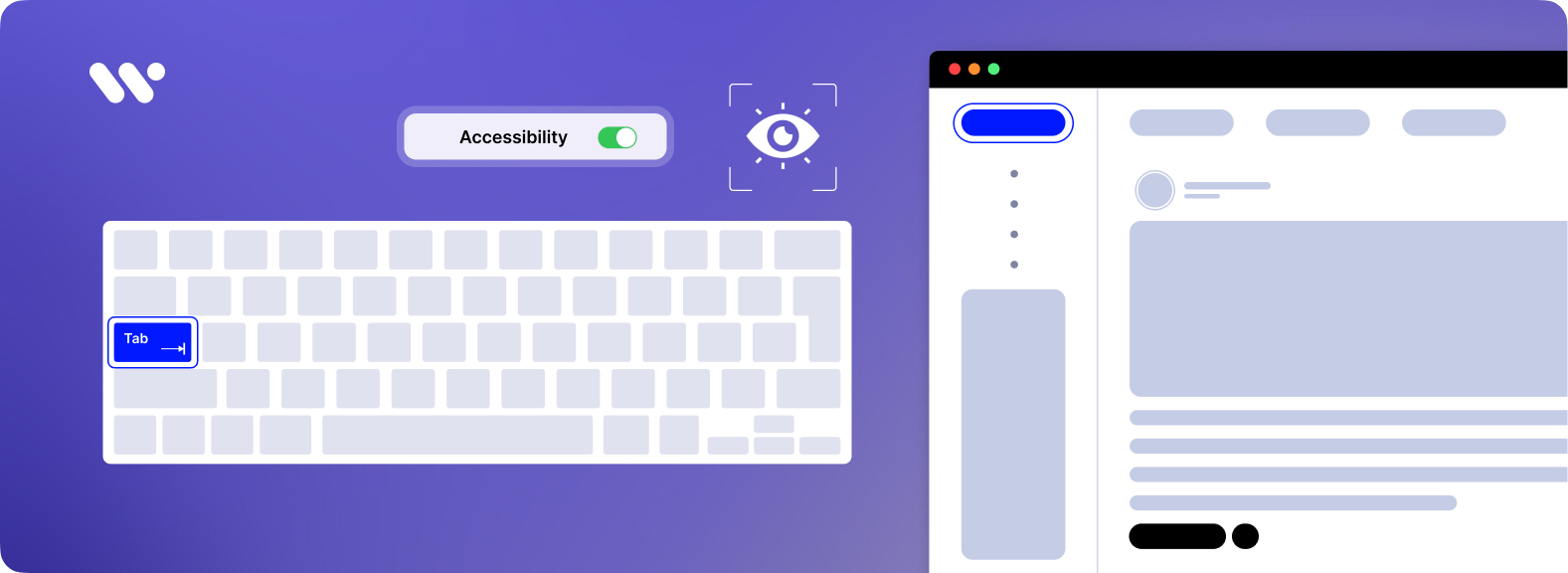
Keyboard Navigation & Usability
Ensuring a keyboard-friendly interface is essential for web accessibility, allowing users to navigate through interactive elements using the Tab key. Logical focus order is crucial; elements should receive keyboard focus in a sequence that matches the visual and functional flow of the page. Avoid focus trapping, where a user becomes stuck within a particular section, hindering navigation. Visible keyboard focus indicators are necessary to show users their current position on the page. Implementing these practices enhances usability for all users, including those relying on keyboard navigation.
CSS Styling for Focus Indicators
Effective CSS focus styling enhances accessibility and user experience by clearly indicating interactive elements' focus state. Utilizing the :focus pseudo-class, developers can apply styles to elements when they receive focus, typically through keyboard navigation or mouse interaction.
Contrast & Visibility
Ensuring that focus indicators have sufficient contrast against their background is essential for web accessibility. The Web Content Accessibility Guidelines (WCAG) specify that focus indicators must have a contrast ratio of at least 3:1 against adjacent colors.
For enhanced accessibility, the WCAG 2.1 introduces the Focus Appearance (Enhanced) criterion, which recommends a higher contrast ratio of 4.5:1 between focused and unfocused states.
Additionally, the WCAG 2.0 emphasizes that any visual information necessary to indicate the state of user interface components, such as focus, must have a minimum contrast ratio of 3:1 with adjacent colors.
To meet these standards, designers should select focus indicator colors that stand out against both the element and its surrounding background. For example, using a thick, two-color focus indicator with a contrast ratio of 9:1 between the colors ensures high visibility.
ARIA & Focus Management
Accessible Rich Internet Applications (WAI-ARIA) enhance web accessibility by providing a framework to define roles, states, and properties for dynamic content and user interface components. Proper implementation of ARIA attributes, such as aria-activedescendant, allows developers to manage focus within complex interactive elements, ensuring assistive technologies accurately convey the active state to users.
Best Practices for ARIA Focus Management
- Use Native HTML Elements When Possible: Leverage native HTML elements that inherently provide accessibility features, reducing the need for additional ARIA attributes
- Ensure Keyboard Accessibility: All interactive ARIA controls should be operable via keyboard, accommodating users who rely on keyboard navigation.
- Maintain Logical Focus Order: Arrange the focus order to align with the visual layout, providing a predictable navigation experience
- Avoid Focus Trapping: Prevent scenarios where focus is confined within a specific section, such as modal dialogs, unless explicitly intended, to ensure users can navigate freely
- Provide Accessible Names for Interactive Elements: Assign clear and descriptive labels to all interactive elements, facilitating understanding for users with assistive technologies.
Browser & Default Focus Behavior
Web browsers provide default focus indicators, such as outlines or highlights, to denote the currently focused interactive element, facilitating navigation for users relying on keyboard inputs. These native indicators are essential for maintaining accessibility standards. However, developers often customize these styles to align with their site's design aesthetics. It's crucial to ensure that such customizations preserve or enhance the visibility of focus indicators to support all users effectively.
Key Considerations:
- Consistency Across Browsers: Different browsers may implement focus indicators uniquely. Ensuring that custom focus styles are consistent across various browsers helps provide a uniform user experience.
- Tabbing Navigation Order: The sequence in which elements receive focus when the Tab key is pressed should follow a logical and intuitive order. This order can be influenced by the elements' arrangement in the HTML or by using the tabindex attribute.
- Avoiding Focus Stealing: Focus stealing occurs when a program redirects keyboard input to itself, potentially causing user confusion. Designing web applications to prevent unintended focus shifts contributes to a smoother navigation experience.
Interactive Elements & Focus
Ensuring that interactive elements such as buttons, links, and form fields have visible focus indicators is crucial for web accessibility. These indicators assist users, especially those navigating via keyboard or assistive technologies, in identifying and interacting with elements effectively.
Key Practices:
- Visible Focus Indicators: Always provide clear and visible focus indicators for interactive elements. This practice helps users understand which element is currently active and ready for interaction. For instance, using a distinct outline or highlight around focused elements enhances visibility.
- Customizing Focus Styles: While browsers offer default focus indicators, customizing these styles allows alignment with your site's design without compromising accessibility. Ensure that custom styles are clearly visible and do not blend with the background or surrounding elements.
- Consistent Focus Across Elements: Interactive elements should have a consistent focus style to provide a uniform navigation experience. This consistency aids users in recognizing focus states across different components of your site.