


Introduction to SEO Accessibility
To make your site truly inclusive and usable, you must implement key Web Accessibility features that support all users, especially those relying on Assistive Technology and need Image Accessibility:
• Keyboard Navigation: Ensure menus, links, buttons, and forms are fully operable using only a keyboard, so people who cannot use a mouse can still navigate your site
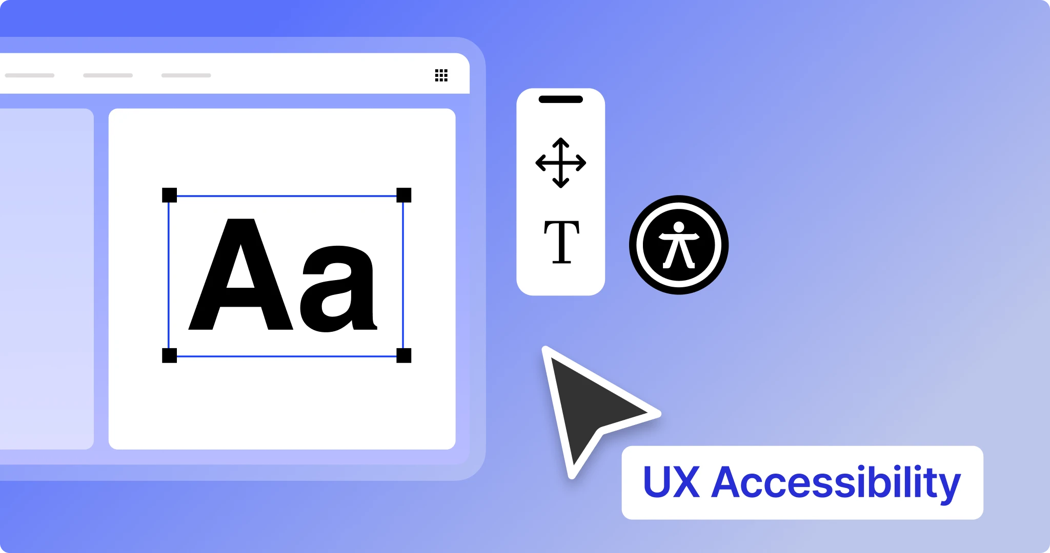
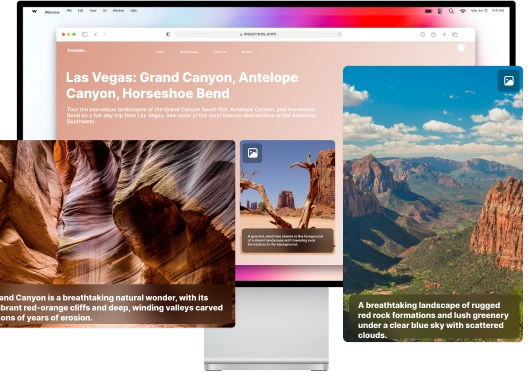
• Descriptive Alt Text for Images: Every image should have meaningful alternative text to convey purpose and content to screen readers, enhancing Image Accessibility and SEO.
• Semantic HTML Structure: Use clear heading hierarchies and landmarks (e.g., <nav>, <main>, <footer>) to help screen readers interpret and navigate your content logically.
• Compatibility with Assistive Technology: Web content must be coded and structured so screen readers, braille displays, and other assistive tools can accurately interpret and present information.
How Does Color Contrast Affect People with Low Vision?
Color contrast is critical because people with low vision often struggle to distinguish text and interface elements when there isn’t enough contrast between foreground and background colors, making content hard or impossible to read. Insufficient contrast especially hinders readability for users with low contrast sensitivity, affecting text, icons, buttons, charts, and other UI components. High contrast not only improves legibility but also helps users understand content regardless of lighting conditions or color perception differences.
Contrast ratio 4.5:1 / 3:1
Web accessibility standards such as WCAG set specific contrast ratio guidelines: a minimum 4.5:1 contrast ratio for normal text and 3:1 for larger text and non-text UI elements so content remains distinguishable for users with vision challenges. Meeting these ratios greatly enhances accessibility for people with moderately low vision and improves overall usability
Red–green color blindness
Color blindness, especially red–green color blindness, affects how users perceive certain color combinations. When color is the only indicator of information (e.g., red for error, green for success), users with this condition may miss content entirely. Including adequate contrast and non-color cues (like icons or text labels) ensures information is communicated clearly to everyone.
Color accessibility testing
Designers should use color accessibility testing tools to verify that their chosen color combinations meet contrast standards. These tools calculate contrast ratios and reveal whether text and UI elements are perceivable by people with visual impairments, helping ensure your site is truly color accessible.
Why Is ALT Text Critical for Blind People and Visually Impaired Users?
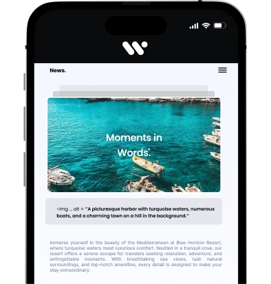
Alt text / alt attribute is essential because it provides a textual alternative to images that screen readers and assistive technologies can read aloud, allowing people who are blind or visually impaired to understand visual content they cannot see. Without alt text, screen readers may read the image file name instead, which conveys no meaningful information and leaves users without context.
For meaningful vs decorative images, only images that convey important information or purpose should receive descriptive alt text. Meaningful images (like product photos, charts, or informative graphics) must have clear alt descriptions so users relying on assistive technology can access the same content as sighted users. Decorative images that do not add context should use an empty alt attribute (alt=""), signaling screen readers to skip them and avoid unnecessary noise.
How Can Your Page Layout Improve Accessibility for Disabled and Older Users?
Why Should You Use Proper Headings (H1, H2, H3) for Cognitive Accessibility?
Using a clear content structure with proper headings like H1, H2, and H3 helps break information into logical, digestible sections that support cognitive accessibility by reducing mental effort and making content easier to scan and understand. A well-structured hierarchy acts like an outline, guiding readers through the flow of ideas so they can quickly grasp key points and relationships between topics.
Headings improve learning clarity by clearly signaling topic changes and organizing themes, which is especially helpful for users with learning or cognitive disabilities who may struggle with large blocks of unstructured text. This clear segmentation makes it easier to follow and remember information.
Using headings with plain language and descriptive labels also supports comprehension for all users — particularly those with cognitive challenges or neurodiverse conditions — because predictable and meaningful titles reduce ambiguity and help set expectations for the content that follows.
How Does Responsive Design Improve Accessibility Across Devices?
Responsive design enables your site to adapt fluidly to different screen sizes and orientations, ensuring content remains readable and usable whether users are on desktops, tablets, or smartphones — a key factor for mobile accessibility. By supporting flexible layouts that reflow without horizontal scrolling and allowing users to zoom text up to at least 200% without breaking the layout, responsive design helps people with low vision, limited dexterity, and those relying on assistive tech interact with your content comfortably across devices.
How Should You Structure Your Page Layout for Better Inclusivity?
To create an inclusive page layout, start with a clear and logical structure that helps all users, especially those using assistive technology, understand and navigate your content easily. Use semantic HTML elements like <header>, <nav>, <main>, and <footer> to define the purpose of each section, creating a digital “map” that screen readers can interpret efficiently.
Three factors to consider in making your website layout:
- Logical Content Flow: Arrange content in a predictable sequence with meaningful headings and sub-headings so users can scan and follow the page effortlessly.
- Landmarks & Navigation: Include navigational landmarks and “skip to content” links that allow keyboard and screen reader users to jump directly to key areas without unnecessary repetition.
- Readability & Space: Use adequate spacing, readable fonts, and clear distinctions between blocks of content so people with cognitive or visual challenges can process information without overload.
A well-structured layout supports inclusivity by making your site easily interpretable and usable for everyone, regardless of device, ability, or assistive technology.
How Can Interactive Elements Be Made Keyboard Accessible?
How Do Keyboard-Only Users Navigate Webpages?
Keyboard-only navigation means users rely entirely on keys such as Tab, Shift + Tab, Enter, and others to move through interactive content—links, buttons, form controls—without using a mouse, which is vital for those with motor disabilities or who use assistive tech like screen readers.
To improve keyboard accessibility, sites should include skip-to links that allow users to jump past repeated navigation directly to main content, saving effort and time
Focus indicators must be clearly visible so keyboard users can see where they are on the page as they tab through elements; otherwise they lose orientation and can’t interact effectively.
Proper focus order and absence of keyboard traps (where focus gets stuck in a region) ensure a predictable, smooth experience for keyboard-only browsing, aligning with web accessibility standards.
What Makes a Form Accessible for Users with Cognitive or Motor Disabilities?
An accessible form must be clear, predictable, and easy to complete for everyone, especially people with cognitive or motor challenges. Here are key practices backed by accessibility standards:
- Labeled forms: Every form control (text field, checkbox, radio button, etc.) should have a visible label programmatically associated with the input using <label> with matching for and id attributes so screen readers announce what the field is for.
- Accessible forms: Instructions should be placed logically near fields and forms must follow a smooth keyboard navigation flow, enabling users to tab through inputs in order without confusion.
- Feedback: Provide clear, immediate feedback for errors and completion (e.g., descriptive error messages near the field and success notifications) so users understand what went wrong and how to fix it without frustration.
How Can You Improve Video and Audio Accessibility on Your Website?
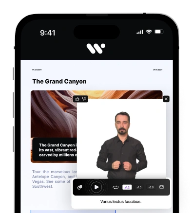
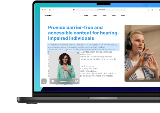
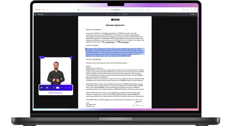
Why Are Captions Essential for Hearing Impaired Users?
Captions & transcripts turn spoken dialogue and important audio cues into on-screen text, giving hearing impaired users equal access to audio content that would otherwise be inaccessible because they can’t hear the sound. Captions include not just words but also speaker identification and key non-speech sounds (like music or effects), making videos understandable in real time
Captions are synchronized with the media and allow Deaf or hard-of-hearing viewers to consume content just as hearing users do, preserving context and timing so nothing is lost or misunderstood. Transcripts complement this by providing a full text version of audio for people who need or prefer to read rather than watch.
Without captions, hearing-impaired individuals are excluded from educational videos, entertainment, webinars, and other digital content, which limits participation and access to vital information — captions ensure inclusive, equitable engagement online.
Should You Disable Autoplay to Improve Accessibility?
Disabling autoplay media is strongly recommended for accessibility because unexpected sound or motion can disorient users with cognitive disabilities, vestibular disorders, or those relying on screen readers, and may negatively affect users in an emotional support accessibility context. Autoplay audio can interfere with assistive technology output, while autoplay video or animations may cause stress, distraction, or motion sensitivity issues. Providing user-controlled playback (play/pause buttons) and respecting autoplay media restrictions ensures a calmer, more predictable experience for all users.
How Do You Ensure Downloadable Documents Are Accessible?
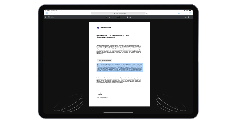
What Makes a PDF Accessible for All Users?
To ensure accessible downloadable files like PDF documents can be used by everyone — including people who rely on screen readers, magnifiers, or keyboard navigation — they must be properly structured and compliant with accessibility standards such as WCAG and PDF/UA (Universal Accessibility).
- Tagged Structure & Logical Reading Order: An accessible PDF uses semantic tags (headings, paragraphs, lists, tables) so assistive technologies can interpret the document’s hierarchy and reading sequence correctly, rather than just presenting flat visual content.
- Searchable, Text-Based Content: Text must be searchable and selectable — scanned image PDFs need OCR (Optical Character Recognition) to convert images into real text that screen readers can access.
- Alternative Text for Images & Metadata: All meaningful images, charts, and figures require descriptive alt text, and the document should include accurate language and title metadata so screen readers use proper pronunciation and context.
- • Navigational Aids & Interactive Elements: Accessible PDFs include bookmarks, clear link labels, and correct tab order for forms or navigation, facilitating efficient movement through the content for users with disabilities
Why Should You Use Plain Language Inside Online Documents?
Using plain language makes online documents easier to read, understand, and navigate, which is especially important for users with cognitive impairment, learning disabilities, or limited literacy skills. Clear wording, short sentences, and familiar terms reduce cognitive load and help users process information without confusion or frustration.
Plain language also benefits non-native speakers and improves overall comprehension for all audiences. These practices are recommended by accessibility guidelines to ensure content is understandable, not just technically accessible.
How Can You Check Whether Your Website Is Accessible to Everyone?
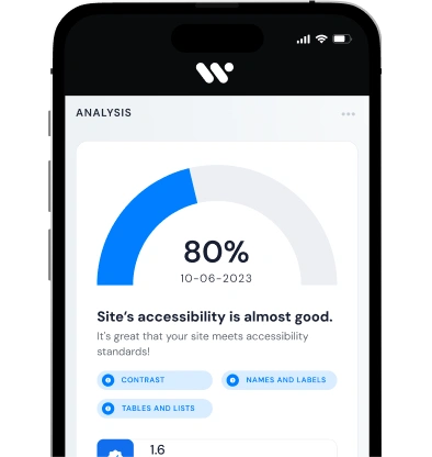
What Is a Website Accessibility Audit and Why Should You Run One?
A website accessibility audit is a systematic evaluation of your site’s HTML, CSS, JavaScript, content structure, navigation, and interactive elements to identify barriers that prevent people with disabilities from using it effectively and check conformance with standards like WCAG
Running an audit helps you check accessibility issues such as missing alt text, keyboard navigation problems, color contrast failures, and improper form labeling — giving you a detailed report with where issues occur and how to fix them.
It also ensures you are legally compliant with accessibility regulations (e.g., ADA in the U.S., EAA in the EU), reducing the risk of lawsuits and penalties while enhancing inclusive user experience and improving SEO.
By integrating both automated scanning and expert manual review, audits uncover not only code-level problems but real-world usability gaps, helping you build a truly accessible website for all users.
What Are the Benefits of Creating an Accessible Website for All Users?
How Does Accessibility Help Blind, Orthopedic, and Low-Vision Users?
Web accessibility ensures blind people can perceive content through screen readers using proper headings, alt text, and semantic HTML, while users with low vision benefit from sufficient color contrast, scalable text, and responsive layouts that prevent loss of readability. For orthopedic disabled users, accessibility enables full interaction via keyboard navigation, larger clickable areas, and avoidance of time-dependent or complex gestures.
By removing physical and sensory barriers, accessible design empowers disabled users to navigate, understand, and interact with digital content independently and equally.
How Does an Accessible Website Improve User Satisfaction and Engagement?
An accessible website creates contented users by making content easy to understand and easy to navigate, reducing frustration and effort for people of all abilities. When users can find information quickly, interact without barriers, and move confidently through a site, engagement metrics such as time on page and return visits naturally improve.
Accessibility benefits everyone, not just people with disabilities, by delivering a smoother, more inclusive user experience that builds trust and satisfaction
Government Digital Services That Must Be Accessible
All government services delivered online must be accessible to individuals with disabilities, ensuring equitable access to essential civic functions. Key examples include Voting and Election Information to support informed participation, Public Meeting Schedules for transparency and engagement, Emergency Alert Systems for timely notifications, and Online Payment Portals for taxes or utility bills.
Even local entities, such as the Los Angeles Unified School District, must make websites, forms, and digital resources fully accessible, aligning with WCAG standards and federal accessibility laws to provide equal access across all public services