


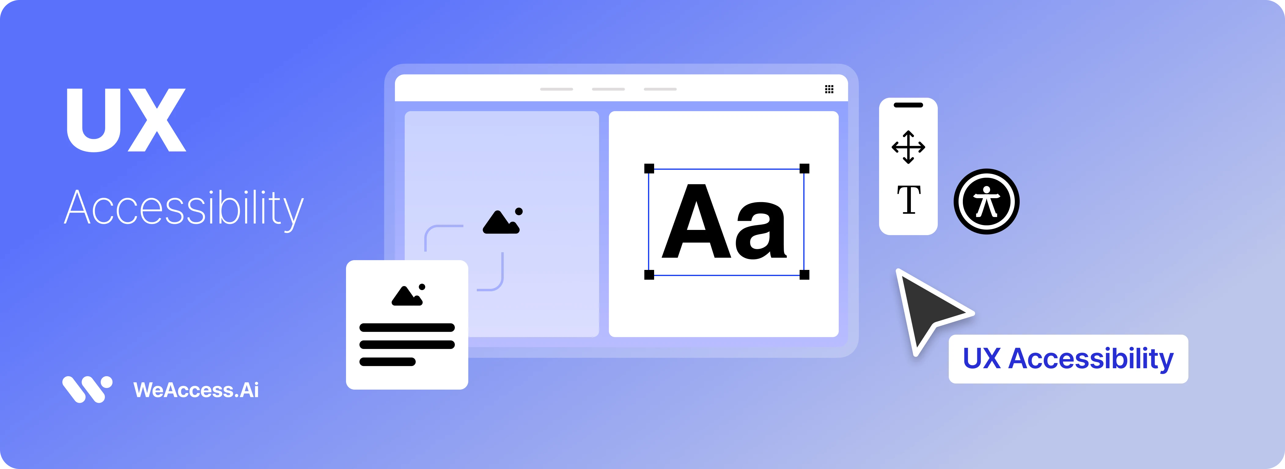
Understanding Accessibility Guidelines and Standards
UX accessibility refers to designing digital products and web experiences that everyone can access, perceive, and interact with — including people with visual, auditory, motor, or cognitive challenges — making the experience inclusive and equitable for all users.
Accessibility is foundational to what is UX design, because user experience isn’t complete unless it serves diverse abilities and contexts of use. By integrating accessible practices such as clear navigation, readable content, keyboard support, and adherence to standards like WCAG, designers ensure that digital interfaces are not barriers but bridges for all users, thereby improving usability, ethical reach, and overall user satisfaction.
Why UX Accessibility Matters
UX accessibility is essential because it expands usability and inclusion across diverse user demographics, including users ages 65+, people with changing abilities, and those who speak different native languages — all of which shape the user journey and experience. Accessible design reduces barriers in interaction design by offering clear navigation, readable content, and language support that improves comprehension for non‑native speakers and older users alike
- Larger audience reach: Designing accessibly includes older adults who may face age‑related vision or motor challenges, ensuring they can complete tasks smoothly
- Better usability: Accessibility boosts overall UX for everyone, not just those with disabilities, by simplifying interaction patterns and improving clarity.
- Cultural & linguistic inclusion: Supporting multiple languages and localized content helps non‑native speakers navigate and engage more effectively.
- Ethical & strategic impact: Inclusive UX practices support equal access, strengthen brand value, and align with core principles of interaction design foundation.
Accessibility vs Usability
While usability focuses on how easily all users can interact with a user interface and complete tasks efficiently, accessibility ensures that those interactions are inclusive, accommodating users with disabilities or diverse needs. In practice, design considerations for accessibility—such as keyboard navigation, screen reader support, and color contrast—enhance overall experience, making interfaces more intuitive and functional for everyone, not just for users without impairments.
Design Considerations for Accessibility
Effective accessible design means integrating inclusive principles into your product’s core UI and design language to ensure all users can interact comfortably and confidently. Start by using scalable text and responsive layouts that adapt across devices and allow users to resize fonts without breaking the interface — a foundational practice for inclusive mobile and web experiences
Ensure touchable elements are large enough (e.g., minimum 44×44 dp for mobile) with adequate spacing to accommodate users with varied dexterity, and test interfaces with tools like Android Accessibility Scanner or VoiceOver to verify screen reader compatibility.
Implement high contrast color palettes that meet WCAG standards (at least 4.5:1 ratio) and avoid relying on color alone to convey meaning by adding text labels or icons.
Provide alternative text for images and captions or transcripts for videos so assistive technologies can communicate content effectively, and design intuitive keyboard navigation and focus indicators for users who cannot use gestures or touch.
Real-world examples of accessible design include descriptive VoiceOver labels on mobile controls, large high‑contrast icons with clear labels, and consistent navigation patterns that work seamlessly across screen sizes and assistive tools.
Inclusive Design Principles
Inclusive design ensures digital products are welcoming and usable for people of all abilities, backgrounds, and contexts by focusing on real human diversity rather than assumptions about a “typical” user. Core principles include recognizing bias and exclusion, learning from diversity, and creating solutions that serve everyone without compromising quality.
Designers should focus on people—understanding their needs through research and involving them in the process to shape an equitable user journey. Inclusive UX also demands flexibility and multiple ways to interact with the interface, ensuring individuals can engage comfortably regardless of ability or context.
Designing for Disabilities
- Vision Disabilities: Support users who are blind or have low vision by providing screen reader compatibility, semantic structure, alt text for images, high contrast, and scalable text to improve readability and navigation.
- Hearing Disabilities: Include captions and transcripts for video/audio content and visual indicators for alerts so deaf or hard‑of‑hearing users can access rich media.
- Motor Disabilities: Ensure keyboard operability for all interactive elements, large touch targets, and support for alternative input devices like switch or voice control to accommodate limited mobility.
- Cognitive Disabilities: Use clear language, consistent navigation patterns, flexible timing, and avoid overly complex layouts to assist users with learning difficulties, ADHD, or dyslexia.
- Dyslexia: Apply readable fonts, adequate spacing, avoid all‑caps text, and organize content logically to reduce reading difficulty and support comprehension.
Visual Treatments & Color Accessibility
Designing for color accessibility means ensuring your user interface supports readability and comprehension for everyone, avoiding Low‑Contrast Text that can be difficult to read — WCAG standards recommend a minimum of 4.5:1 contrast for normal text and 3:1 for larger UI elements to aid visual clarity.
Offering Dark Mode / Light Mode options lets users choose the visual treatment that best suits their comfort and context, but switching themes doesn’t automatically meet accessibility requirements unless the color contrast is maintained in each mode.
Always include Alt Text for images and visual elements so assistive technologies (like screen readers) can convey context that color or visuals alone cannot, improving both accessibility and UX writing clarity.
User Interface & Interaction Design
Designing an accessible user interface (UI) means enabling Keyboard Navigation so users can move through all interactive elements using keys like Tab, Shift + Tab, and arrow keys — crucial for people with motor limitations, screen reader users, or those who prefer non‑mouse input. This ensures all buttons, links, and controls are reachable and logical in sequence without a mouse.
Supporting Switch Devices (assistive hardware that replaces traditional touch or pointer input) allows users with significant motor impairments to interact with mobile elements through adaptive controls, improving their ability to engage with apps.
In the interaction design foundation of accessible products, these input alternatives expand usability and ensure a seamless mobile app experience across diverse user needs, enhancing overall engagement and satisfaction.
Guidelines & Standards
When creating accessible digital experiences, adhering to established guidelines and standards ensures both usability and legal compliance. The Web Content Accessibility Guidelines (WCAG) 2.2 provide a global benchmark for accessibility best practices across web and mobile interfaces, organized under four principles—perceivable, operable, understandable, and robust—with testable success criteria at levels A, AA, and AAA that define how digital content should be made accessible.
In the European Union, the European Accessibility Act (EAA) legally requires that digital products and services, including websites and apps offered within the EU market, meet specific accessibility requirements such as accessible navigation, information formats, and support services.
In the United States, ADA compliance (Americans with Disabilities Act) applies accessibility requirements to digital services and is often interpreted through WCAG standards, meaning digital products may need to demonstrate adherence to these rules to avoid legal risk.
Best practices combine these standards with regular audits, user testing with assistive technologies, and documentation of compliance efforts, helping teams not only meet legal obligations but also enhance overall user experience for diverse audiences.
Accessibility Laws and Compliance
ADA compliance (Americans with Disabilities Act) legally requires U.S. digital services to be accessible under disability‑rights laws, and failure to meet these obligations often results in litigation, enforcement actions, and financial penalties—even over 8,800 ADA‑related cases in recent years.
The European Accessibility Act (EAA) is now in force (effective June 28 2025) and mandates that digital products and services offered in the EU meet defined accessibility rules, helping remove barriers for people with disabilities across member states.
While there is no universally issued certificate that guarantees lifelong compliance, many accessibility audit services and compliance frameworks exist to help organizations assess and document their conformance with ADA, EAA, and WCAG standards.
UX Accessibility Best Practices
- Progressive Enhancement: Start with a robust baseline experience that works for all users (including those with limited tech or assistive tools), then layer on enhanced features for users with modern browsers or devices — this ensures basic accessibility first, then richer interaction for capable environments.
- Follow Established Guidelines & Standards: Adhering to WCAG best practices like sufficient contrast, keyboard accessibility, and semantic structure helps make designs inclusive and compliant with widely accepted technical benchmarks.
- Clear UX Writing: Use plain, descriptive language in labels, instructions, and error messages to improve comprehension for people with cognitive barriers and support assistive technologies.
- Design with Disabilities in Mind: Test with screen readers, keyboard‑only navigation, and real users with disabilities to refine experience and ensure your design truly meets diverse needs.
User Research & Testing
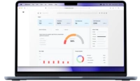
User research and software test practices are essential for identifying accessibility issues and ensuring digital products meet real‑world needs. Begin with a comprehensive accessibility audit that uses both automated checkers (e.g., weaccess accessibility checker ) to detect baseline issues and manual reviews against WCAG guidelines, enabling detailed validation of UI accessibility.
Integrate accessibility testing early in the design and development lifecycle through accessibility audits and checklists, and follow with human testing involving diverse users — including people with disabilities — to capture issues that automated tools may miss, yielding richer data and actionable insights.
Conduct hybrid testing that combines automatic scanners, expert evaluations, and real user interactions (including assistive technologies like screen readers and switch devices) to ensure deep coverage and meaningful results, not just surface‑level fixes.
document all testing findings in an audit report that highlights barriers, prioritizes fixes, and supports iterative improvements, making accessibility a measurable and ongoing quality objective rather than a one‑off check.
Conducting Accessibility Research
Conducting Accessibility Research begins with systematic user research to understand the real needs, behaviors, and challenges of diverse users — including those with disabilities — so design decisions are grounded in evidence, not assumptions. User research involves creating personas that represent distinct user types and mapping their user journey to pinpoint where accessibility barriers occur and how users interact with your product at each stage.
Effective accessibility research integrates inclusive methods (interviews, contextual inquiry, usability tests) with assistive technology testing to uncover barriers that automated tools alone may miss, helping teams prioritize meaningful improvements and align outcomes with user goals and experience expectations.
Usability Testing & Audits
Usability testing & audits are essential for uncovering accessibility issues that automated tools alone often miss, ensuring digital products truly serve all users. A thorough accessibility audit combines automated scans with manual reviews against WCAG 2.2 standards, identifying barriers in navigation, content structure, and interaction that affect diverse users.
• Automated tools quickly detect basic accessibility problems like missing alt text or color contrast failures but capture only part of the picture.
- Manual audits and expert evaluations provide context‑aware insights and actionable recommendations beyond what software alone can find.
- Human usability tests involving real users with disabilities reveal real‑world challenges that neither automated nor expert reviews can fully anticipate, improving accuracy and user‑centered outcomes.
Forms & Interaction
Forms & Interaction design ensures your user interface (UI) is usable and accessible for everyone by following structured form practices that support clear completion, navigation, and feedback. Accessible forms begin with Form Labels that are programmatically associated with each input field (e.g., using <label> with for and matching id), helping screen readers announce the field’s purpose correctly.
• Logical Tab Order: Maintain a sequential navigation order that aligns with the visual layout so users tab through fields predictably (left‑to‑right, top‑to‑bottom) and avoid keyboard traps that block progression.
- Interactive Elements: Ensure buttons, dropdowns, and other controls are focusable and operable via keyboard and assistive tools; native form controls typically provide better compatibility,
- Focus States: Provide visible focus indicators (like outlines or highlights) on interactive elements so users relying on keyboards can easily see where they are within the form.
- Clear UX writing for instructions, error messages, and field requirements further improves comprehension and completion rates, making forms more inclusive for everyone.
Consistent Navigation & Focus
Maintaining consistent navigation across your user interface ensures users can predict where key elements are located, reducing cognitive load and improving overall interaction design foundation.
Proper Tab Order allows keyboard users to move logically through content, while Focus States provide visual cues that indicate which element is active. Giving users control over navigation, such as skip links or adjustable menus, enhances accessibility by supporting diverse interaction needs and improving usability for everyone.
Embedding Accessibility in UX Design
Embedding accessibility into UX design means proactively creating inclusive experiences, not treating accessibility as an afterthought or checklist item. Start by integrating accessibility requirements into your design process from day one including audits, inclusive components, and real user testing so accessibility becomes part of your design workflow rather than a separate fix later. Early integration of accessible components and inclusive UX writing supports clear communication and ensures all users can understand and navigate your interface.
Assistive Technology (AT)
Assistive Technology enhances user interface accessibility and overall experience by enabling people with diverse abilities to interact with digital products in ways that suit their needs. Common accessibility tools / features include:
- Screen Readers: Software that converts on‑screen text and elements into speech or braille, helping people who are blind or have low vision access content. Popular examples include VoiceOver, JAWS, and NVDA.
- Screen Magnifiers: Tools that enlarge all or part of the display, improving readability for users with low vision by increasing text and UI element size
- Switch Devices: Adaptive hardware or software interfaces allowing users with motor impairments to control devices using buttons, joysticks, head pointers, or other custom inputs.
- Accessibility Tools / Features: Built‑in OS features like AssistiveTouch enable alternative interaction methods (e.g., virtual menus for gesture replacement), and accessibility widgets provide controls for text size, keyboard navigation, and visual enhancements that support inclusive use.
Making Accessibility a Core Part of Design
Embedding inclusive principles into your UX workflow means prioritizing accessibility at every stage of the design process rather than treating it as an afterthought. From project kickoff through research, wireframing, prototyping, and development, accessibility should be part of your interaction design foundation so that products are usable by diverse users and not retrofitted later.
This includes establishing clear guidelines and standards (e.g., WCAG) early on, educating teams about accessibility goals, and embedding those practices into design systems and component libraries. Research shows that this approach not only broadens your user base and improves overall quality, but also fosters innovation by challenging designers to solve for real user needs rather than assumptions.
Effective UX writing is part of this core strategy too — using clear, plain language in labels, instructions, and content helps all users understand and interact with your product. Ultimately, integrating accessibility from the start leads to richer, more inclusive user experiences that reflect ethical design values and real‑world usability for everyone.
Practical Examples & Case Studies
Real‑world examples of accessible mobile app and user interface design show how thoughtful UX improves the user journey and overall experience:
Health Companion App Case Study: A mobile health app designed for older adults maps the user’s journey across key tasks like logging symptoms, managing medications, and scheduling follow‑ups to identify pain points and simplify interactions. This method highlights how understanding users’ needs shapes UI decisions that reduce frustration and improve usability.
Travel App UX/UI Example: Case studies of travel and safety apps illustrate how larger text, clear icons, and simple navigation improve visibility and accessibility for users of varying tech skills, ensuring key actions (like emergency calls) are intuitive and fast to access.
Accessibility in Mobile UX Best Practices: Mobile UX articles demonstrate that integrating voice feedback, appropriate color contrast, and screen reader support in mobile design enhances accessibility for all users — particularly those with visual impairments or motor challenges.
These practical implementations show that prioritizing accessibility throughout the design process leads to more inclusive user journeys and interfaces that work better for everyone, not just a subset of users.
Resources & Learning
To deepen your understanding of accessible UX design and stay current with guidelines and research, there are reputable resources and structured learning paths that blend theory, standards, and practical skills:
- Interaction Design Foundation Accessibility Course: Offers a comprehensive course on designing for accessibility with expert‑graded modules and an industry‑recognized certificate, helping you apply WCAG principles and inclusive UX methods.
- W3C/WAI Digital Accessibility Foundations (Free): A foundational course from the Web Accessibility Initiative that covers international accessibility standards (WCAG) and practical tasks including accessibility checks and design practices.
- Coursera UX Accessibility Courses: Platforms like Coursera provide UX design specializations and accessibility‑focused modules (including research, prototyping, and UI design) with shareable certificates you can add to your professional portfolio.
- Accessibility Foundations on Uxcel: A short, highly rated course breaking down inclusive design principles and best practices for building accessible products
Faq
1- what is an accessibility consideration in ui ux?
An accessibility consideration in UI/UX is any design decision made to ensure digital products are usable by everyone—including individuals with disabilities—so they can perceive, understand, navigate, and interact with the interface effectively. This includes practices like using alt text for images, ensuring keyboard navigation, providing clear labels and instructions, maintaining sufficient color contrast, and supporting assistive technologies such as screen readers. These considerations make designs inclusive and equitable, improving both accessibility and overall user experience for all users.
2- FAQ: How to measure accessibility UX (with WeAccess Accessibility Checker)
To measure accessibility UX, you evaluate both technical compliance and real-world experience using tools and tests that reveal how accessible your interface truly is:
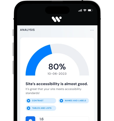
Run an automated accessibility scan: You can use tools like the WeAccess Scan extension to automatically detect WCAG violations (missing alt text, poor contrast, ARIA errors, focus order issues) and generate detailed issue reports that highlight barriers in your site or app UI. This gives you a baseline accessibility score and concrete problems to address.
3: What is WCAG in UX?
WCAG (Web Content Accessibility Guidelines) is an international standard that defines how to design digital experiences that are accessible to everyone.
In UX, it guides designers to create interfaces that are perceivable, operable, understandable, and robust.
WCAG ensures usability for people with disabilities and compatibility with assistive technologies.
Overall, it helps build more inclusive, usable, and effective user experiences.