What Is Color Contrast on Mobile Devices?

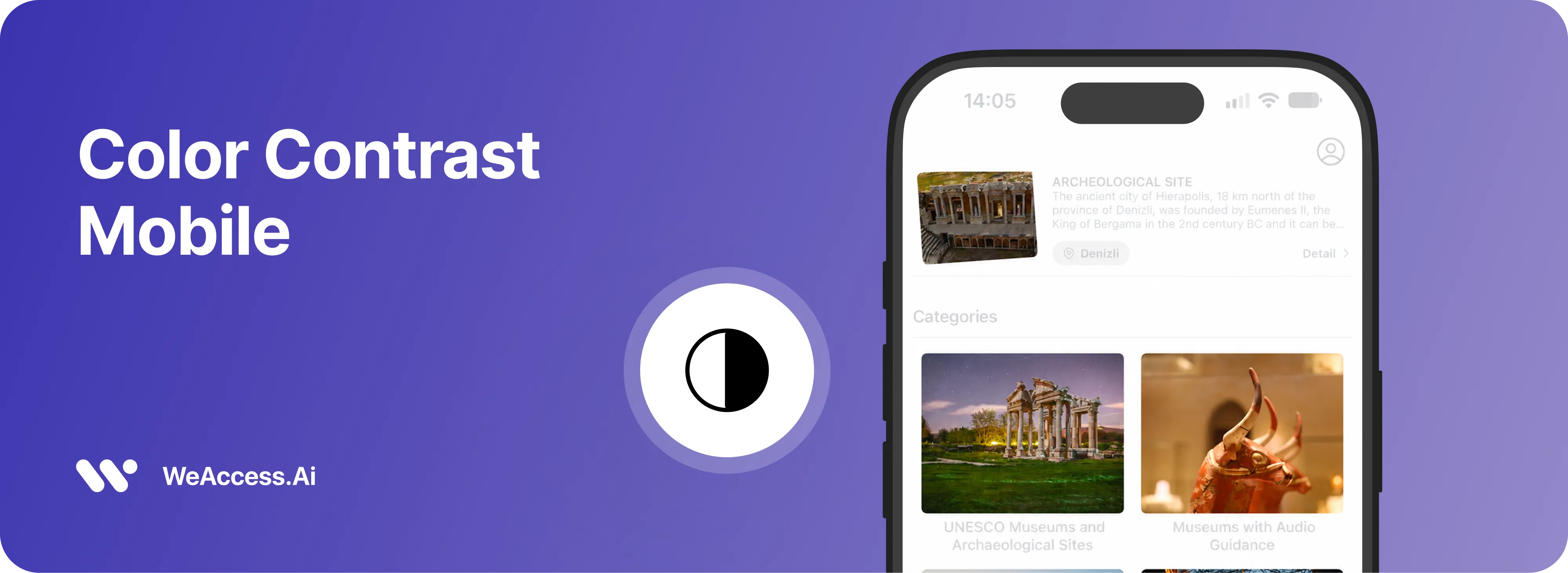
Mobile color contrast is a key part of mobile accessibility (a11y) that helps people read text, recognize icons, and interact with content on a mobile device. Effective color contrast makes mobile websites and apps easier to use for people with low vision or color vision deficiencies, while improving readability in different lighting conditions. Following WCAG contrast requirements helps teams create more inclusive digital experiences without relying on color alone to communicate important information.
Why Is Color Contrast Important for Mobile Accessibility?
Color contrast is essential for mobile accessibility because it improves readability and helps users distinguish text, icons, buttons, and other interface elements on small screens. Insufficient contrast can make content difficult to read, particularly for people with low vision or color vision deficiencies, while high contrast helps users identify important information in different lighting conditions. By maintaining accessible contrast levels and avoiding color as the sole way to communicate meaning, designers can create more inclusive mobile experiences.
For example, a mobile banking app with pale gray text on a white background may make account balances difficult to read. Using darker text, clearly distinguishable buttons, and visible error indicators helps customers access information and complete transactions more confidently.
What Are the WCAG Color Contrast Requirements for Mobile Devices?
Color contrast is one of the core criteria in WCAG for mobile accessibility. These requirements help make mobile websites and apps easier to read and navigate. Under WCAG 2.2 AA, normal text requires a contrast ratio of at least 4.5:1, while large text and essential interface components generally require 3:1 contrast. Following these mobile accessibility guidelines improves a11y and helps designers check contrast to ensure content remains distinguishable across mobile devices.
What Color Contrast Ratios Should You Use in Mobile UI Design?
In mobile UI design, choosing accessible color combinations and a balanced color palette improves readability and usability. WCAG recommends a contrast ratio of at least 4.5:1 for normal text and 3:1 for large text and essential interface components. While black and white often provide high contrast, designers should also test primary colors, yellow, and neutral shades carefully, as changes in hue and tone can affect visibility.
- Text: Use 4.5:1 contrast for normal text.
- Large text: Maintain at least 3:1 contrast.
- UI components: Aim for 3:1 contrast against adjacent colors.
- Color palette: Test every combination instead of relying on high-contrast colors alone.
What Are the Most Common Mobile Color Contrast Issues?
Common mobile color contrast issues can make text, buttons, and icons difficult to read, reducing readability and creating barriers to mobile accessibility. These problems may become more noticeable under bright lighting or for users with color vision deficiencies.
- Low text contrast: Similar foreground and background colors reduce readability.
- Poor brightness balance: Screen glare and bright surroundings make content harder to see.
- Color-only indicators: Using color alone to communicate errors or status creates barriers for people with color vision deficiencies.
- Weak button contrast: Low-contrast buttons and icons make interactive elements harder to identify.
- Inconsistent high-contrast design: Some elements remain difficult to distinguish even when other parts of the interface use high-contrast colors.
H2: How Can You Choose Accessible Colors for Mobile Interfaces?
Choosing an accessible color palette for mobile interfaces requires thoughtful color combinations, sufficient contrast, and consistent UI design. Select primary colors that remain distinguishable against backgrounds, and test black and white, yellow, and neutral shades before applying them to text, buttons, and icons. Prioritize high contrast while ensuring colors communicate information clearly without relying on color alone.
- Test contrast ratios: Meet WCAG requirements for text and interface components.
- Choose background colors carefully: Pair light backgrounds with dark text or vice versa.
- Use colors consistently: Apply primary and neutral colors systematically across the interface.
- Avoid color-only signals: Combine colors with labels, icons, or other visual cues.
- Test on mobile screens: Check readability at different brightness levels and in various lighting conditions.
How Can You Improve Text Readability on Mobile Screens?
Improving readability on a mobile device requires clear typography, sufficient contrast, and layouts that adapt to smaller screens. Text can become difficult to read when font sizes are too small, backgrounds create glare, or colors lack sufficient contrast. Using high contrast and testing screens at different brightness levels helps users read content more comfortably.
- Use readable font sizes: Avoid tiny text and allow users to zoom when needed.
- Maintain sufficient contrast: Follow WCAG contrast requirements for text and backgrounds.
- Choose clear typography: Use legible fonts and appropriate line spacing.
- Avoid distracting backgrounds: Keep text backgrounds simple and uncluttered.
- Test different conditions: Check readability across mobile devices, screen brightness settings, and lighting environments.
Which Tools Can You Use to Check Mobile Color Contrast?
A color contrast checker helps teams check contrast between text, backgrounds, and interface elements to improve mobile accessibility and a11y. Use these tools to test color combinations against WCAG requirements and verify readability across different mobile devices.
- WebAIM Contrast Checker: Measures foreground and background color contrast ratios.
- Google Accessibility Scanner: Identifies accessibility issues in Android apps, including some contrast problems.
- Colour Contrast Analyser: Evaluates text and graphical element contrast on desktop designs.
- Browser developer tools: Inspect website colors and accessibility properties during mobile testing.